Sunday, November 23, 2014

FOR SALE


Overman Pod Chair, original upholstery, good condition $150
 Danish relief sculpture on burlap background. $25.00

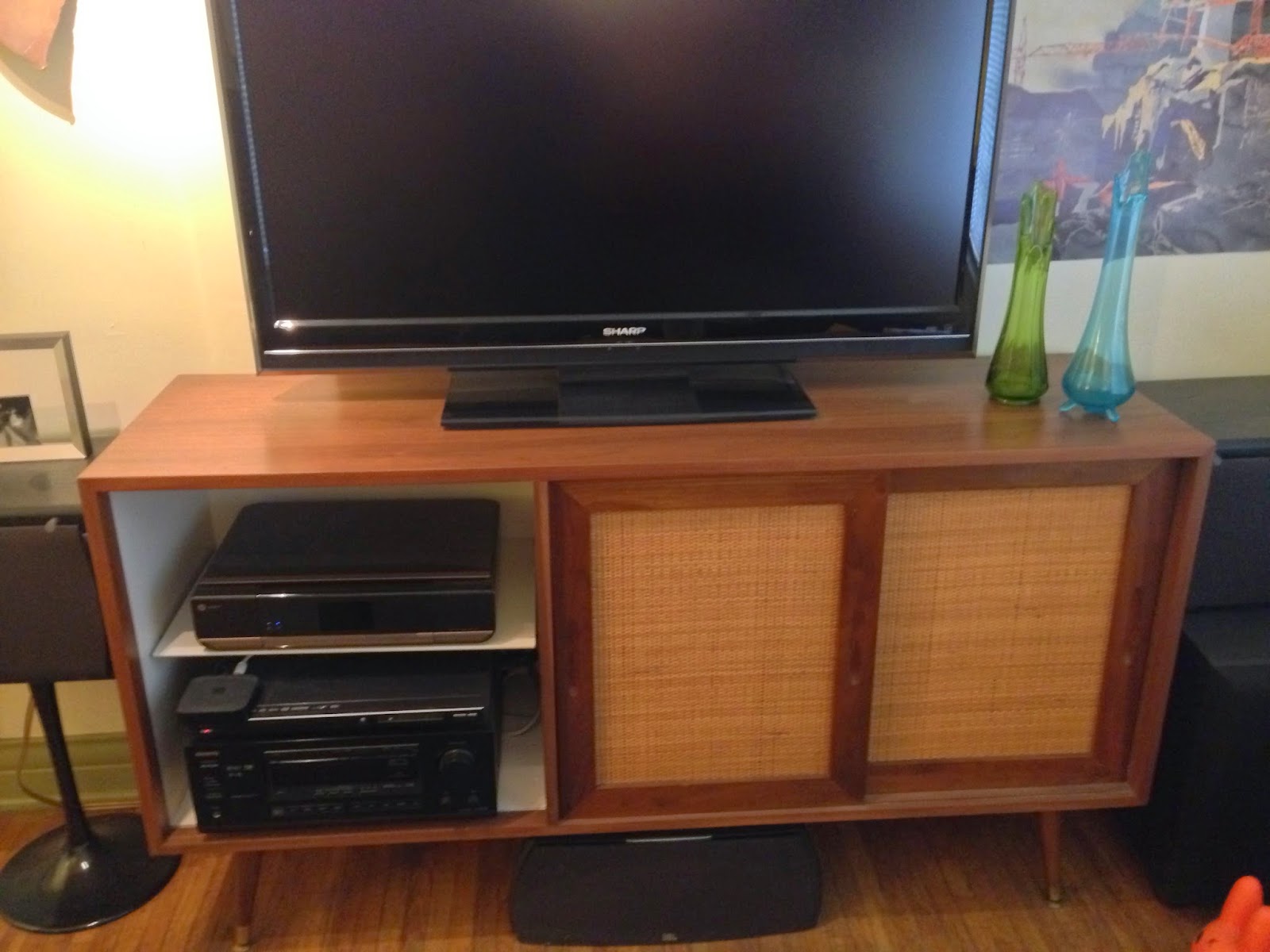
 Small Mid Century Cabinet - $250 Refinished purchased from Danish Modern LA, like new condition

 Ceramic ceiling lamp chartreuse $100

 Heavy chrome swing arm lamp with original shade $45


 Mid Century Dresser 18.5"x 38"- $350 Top drawer has a flip up mirror. Excellent condition hardwood construction, dovetail joints, solid wood legs


 Mid Century Fiberglass Chair - $10 Poor condition


 Mid Century Floor Lamp $400 - Two bulbs, original shade, excellent condition. Same lamp is listed for 895 at Danish Modern LA  http://danishmodernla.com/product/mid-century-sculptural-floor-lamp/


 1950s Hermle (German) clock with chimes $20- Not working but looks great


 Mid Century Credenza - $650. 60"x18" Completely refinished, like new condition. Purchased from Danish Modern LA. Similar items start at $1,200


 For Sale: Dux Lounge Chair - $400. Frame and foam in excellent condition, has been reupholstered. Same chair at Mid Century LA is $1,900 http://www.midcenturyla.com/ProductDetail.aspx?subCat=lou&product_sku=stg-lou-4101


 McCoy Scandialine Planter $45


Amazing Teak Mid Century Cabinet. $650 - 30.5" x 15.5" x 46" Two drawers at bottom, adjustable shelf inside. Excellent condition
Similar cabinet on Ebay is $1350  http://www.ebay.com/itm/Danish-Modern-Teak-Gentlemans-Chest-Cabinet-Dresser-Mini-Armoire-/331376687357

Tuesday, June 25, 2013

The Psychology of Color


Color psychology is the study of color as an influence on or a determinant of human behavior. However, the interface between color and environmental stimuli is highly complex, and contextual. 

The general model of color psychology relies on six basic principles:
Color can carry specific meaning.
The meaning of color is either learned or biologically innate.
The perception of a color creates an automatic evaluation by the person perceiving.
The evaluation process creates color motivated behaviors.
Color usually exerts its influence automatically.
Color meaning and effect is contextual.

Perceptions not obviously related to color, such as the palatability of food, may in fact be partially determined by color. Not only the color of the food itself but also that of everything in the eater's field of vision can affect this. Josef Albers's role in the understanding of color perception was through his research of how colors interact with each other. He also studied the optical illusions of color and how different hues looked the same.  Look closely at the image below, the "Xs" are the same color


Color has long been used to create feelings of coziness or spaciousness. However, how people are affected by different color stimuli varies from person to person.
Blue is the top choice for 35% of Americans, followed by green (16%), purple (10%) and red (9%).
A preference for blue and green may be due to a preference for certain habitats that were beneficial in the ancestral environment. There is also evidence that color preference may depend on ambient temperature. People who are cold prefer warm colors like red and yellow while people who are hot prefer cool colors like blue and green.
Some research has concluded that women and men respectively prefer "warm" and "cool" colors.
A few studies have shown that cultural background has a strong influence on color preference. These studies have shown that people from the same region regardless of race will have the same color preferences. Also, one region may have different preferences than another region.
Children's preferences for colors they find to be pleasant and comforting can be changed and can vary, while adult color preference is usually non-malleable. Some studies find that color can affect mood. However, these studies do not agree on precisely which moods are brought out by which colors.
Despite cross-cultural differences regarding what different colors meant there were cross-cultural similarities regarding what emotional states people associated with different colors in one study. For example, the color red was perceived as strong and active.

You can see from the below chart that there is some cultural disagreement when it comes to the meaning and or feelings associated with color.


Light and color can influence how people perceive the area around them. Different light sources affect how the colors of walls and other objects are seen. Specific hues of colors seen under natural sunlight may vary when seen under the light from an incandescent lighting: lighter colors may appear to be more orange or brownish and darker colors may appear even darker.  Light and the color of an object can affect how one perceives its positioning. If light or shadow, or the color of the object, masks an object's true contour (outline of a figure) it can appear to be shaped differently than it really is. Objects under a uniform light-source will promote better impression of three-dimensional shape.  The color of an object may affect whether or not it seems to be in motion. In particular, the trajectories of objects under a light source whose intensity varies with space are more difficult to determine than identical objects under a uniform light source. This could possibly be interpreted as interference between motion and color perception, both of which are more difficult under variable lighting.


Carl Jung is most prominently associated with the pioneering stages of color psychology. Jung was most interested in colors’ properties and meanings, as well as in art’s potential as a tool for psychotherapy. His studies in and writings on color symbolism cover a broad range of topics, from mandalas to the works of Picasso to the near-universal sovereignty of the color gold, the lattermost of which, according to Charles A. Riley II, “expresses ... the apex of spirituality, and intuition”. In pursuing his studies of color usage and effects across cultures and time periods, as well as in examining his patients’ self-created mandalas, Jung attempted to unlock and develop a language, or code, the ciphers of which would be colors. He looked to alchemy to further his understanding of the secret language of color, finding the key to his research in alchemical transmutation. His work has historically informed the modern field of color psychology. In studying the human psyche, Jung created a theory with our psyche consisting of three parts, the third being the collective unconscious. You could call it your "psychic inheritance." It is the reservoir of our experiences as a species, a kind of knowledge we are all born with. And yet we can never be directly conscious of it. It influences all of our experiences and behaviors, most especially the emotional ones, but we only know about it indirectly, by looking at those influences. 

Jung's Archetypal Color Meanings:
Color = positive (negative)                                                                
Black = power (death, mourning)
Blue = nobility, tranquility (depression)
Brown = Earth, nature (confusion)
Gray = neutral (passionless)
Green = fertility, renewal, wealth (greed, envy)
Orange = adventure, change (forced change, disruptiveness)
Purple = royalty, positive personal growth (injury)
Red = sex, love (sacrifice, taboo, humiliation, danger)
White = purity, wholesomeness, rebirth (emptiness)
Yellow = enlightenment, wisdom (cowardice, illness)

In 2000, Glasgow installed blue street lighting in certain neighborhoods and subsequently reported the anecdotal finding of reduced crime in these areas. This report was picked up by several news outlets.


Color in Advertising
The physiological and emotional effect of color in each person is influenced by several factors such as past experiences, culture, religion, natural environment, gender, race, and nationality.  Research on the effects of color on product preference and marketing shows that product color could affect consumer preference and hence purchasing culture. Most results show that it is not a specific color that attracts all audiences, but that certain colors are deemed appropriate for certain products. Customers generally make an initial judgment on a product within 90 seconds of interaction with that product and about 62%-90% of that judgment is based on color. People often see the logo of a brand or company as a representation of that company. Without prior experience to a logo, we begin to associate a brand with certain characteristics based on the primary logo color. 

 Color affects peoples’ perceptions of a new or unknown company. Some companies such as Victoria's Secret and H&R Block used color to change their corporate image and create a new brand personality for a specific target audience.  Research done on the relationship between logo color and five personality traits had participants rate a computer made logo in different colors on scales relating to the dimensions of brand personality. Relationships were found between color and sincerity, excitement, competence, sophistication, and ruggedness.  In turn color affects perceived brand personality and brand personality affects purchasing intent. 
Although color can be useful in marketing, its value and extent of use depends on how it is used and the audience it is used on.  The use of color will have different effects on different people, therefore experimental findings cannot be taken as universally true.


So what is color really then.  We know it has meanings culturally and built into our collective unconscious.  We know it influences us in varying ways and is contextual.  Basically it is pretty dynamic so how does anyone choose a color.  OK so let's get a bit more scientific about it. 


Color is light.  
The colors we perceive occur within what is called the visible spectrum pictured above.  

The visible spectrum is the portion of the electromagnetic spectrum that is visible to (can be detected by) the human eye. Electromagnetic radiation in this range of wavelengths is called visible light or simply light. A typical human eye will respond to wavelengths from about 390 to 700 nm. In terms of frequency, this corresponds to a band in the vicinity of 430–790 THz. A light-adapted eye generally has its maximum sensitivity at around 555 nm (540 THz), in the green region of the optical spectrum. The spectrum does not, however, contain all the colors that the human eyes and brain can distinguish. Unsaturated colors such as pink, or purple variations such as magenta, are absent, for example, because they can be made only by a mix of multiple wavelengths. Colors containing only one wavelength are also called pure colors.

Like all things in our Universe, color is a vibration. You can see from the chart above that the wavelength of red is the largest and the frequency is the slowest. Therefore red is has a low vibration and vice versa for violet.
Our bodies are also vibrating and also tend to adopt vibrations from our environments. If you have ever been in a room full of angry people or listened to Mozart you may have experienced a shift in your emotional state. This phenomenon is called brain entrainment which is based upon the assumption that the human brain has a tendency to change its dominant EEG frequency towards the frequency of a dominant external stimulus be it audible or visual. The sensation of color, therefore, depends on the number of vibrations of light ether, just as the pitch of a note depends on the number of vibrations of the sounding body. 
There is one distinction here, the frequency of color is measured in terahertz or 10 to the 12th power Hz 


1012 HzTHzterahertz

However our brains operate a bit differently.  Did you know that we all have five brain frequencies (Beta, Alpha, Theta, Delta and Gamma), and each frequency is measured in cycles per second (Hz) and has its own set of characteristics representing a specific level of brain activity and a unique state of consciousness?  They basically cycle from awake to sleep.

1) Beta (14-40Hz) – The Waking Consciousness And Reasoning Wave
Beta brain waves are associated with normal waking consciousness and a heightened state of alertness, logic and critical reasoning. While Beta brain waves are important for effective functioning throughout the day, they also can translate into stress, anxiety and restlessness. The voice of Beta can be described as being that nagging little inner critic that gets louder the higher you go into range. Therefore, with a majority of adults operate at Beta; it’s little surprise that stress is today’s most common health problem.

2) Alpha (7.5-14Hz) – The Deep Relaxation Wave
Alpha brain waves are present in deep relaxation and usually when the eyes are closed, when you’re slipping into a lovely daydream or during light meditation. It is an optimal time to program the mind for success and it also heightens your imagination, visualization, memory, learning and concentration. It is the gateway to your subconscious mind and lies at the base of your conscious awareness. The voice of Alpha is your intuition, which becomes clearer and more profound the closer you get to 7.5Hz. 

3) Theta (4-7.5Hz) – The Light Meditation And Sleeping Wave
Theta brain waves are present during deep meditation and light sleep, including the all-important REM dream state. It is the realm of your subconsciousness and only experienced momentarily as you drift off to sleep from Alpha and wake from deep sleep (from Delta).
It is said that a sense of deep spiritual connection and unity with the universe can be experienced at Theta. Your mind’s most deep-seated programs are at Theta and it is where you experience vivid visualizations, great inspiration, profound creativity and exceptional insight. Unlike your other brain waves, the elusive voice of Theta is a silent voice.
It is at the Alpha-Theta border, from 7Hz to 8Hz, where the optimal range for visualization, mind programming and using the creative power of your mind begins. It’s the mental state which you consciously create your reality. At this frequency, you are conscious of your surroundings however your body is in deep relaxation.

4) Delta (0.5-4Hz) – The Deep Sleep Wave
The Delta frequency is the slowest of the frequencies and is experienced in deep, dreamless sleep and in very deep, transcendental meditation where awareness is fully detached. Delta is the realm of your unconscious mind, and the gateway to the universal mind and the collective unconscious, where information received is otherwise unavailable at the conscious level. Among many things, deep sleep is important for the healing process – as it’s linked with deep healing and regeneration. Hence, not having enough deep sleep is detrimental to your health in more ways than one.

5) Gamma (above 40Hz) – The Insight Wave
This range is the most recently discovered and is the fastest frequency at above 40Hz. While little is known about this state of mind, initial research shows Gamma waves are associated with bursts of insight and high-level information processing.

You can see how our brains go from a state of excited physical awake-ness to deep sleep / unconsciousness just like the colors from red to violet.  They both start at low frequency to high frequency 
If we cross reference the chakra system it all starts to make sense.


Notice how the lower or root chakra is red.  This is the lowest state of awareness but the most excited state of physicality and corresponds to Beta waves.  Within this system we move from the physical to the spiritual realm as we progress up the scale of chakras which are color coded exactly the same as the color spectrum, from red to violet.  Violet is the highest state of consciousness    which corresponds to Gamma waves.  Green is the balance in the middle of the physical and spiritual realms.  

So color can correspond to a state of being which is the vibrational state of our bodies.
It is both physical and psychological in its effect upon the mind. The physical effect is a chemical one; the psychological effect is psychic. The nervous system reflects its disturbances upon the mind; hence the sensation of pain or pleasure and the emotional states that accompany them. This is true of all the colors. Primary colors are radical, elemental, and fixed in their vibrations or wave lengths, and hence, when once the effects of the sensations which they produce on the mind are known, their uniformity can always be depended upon. Red for example is thermal and a stimulant and blue is electrical and depressing. They act uniformly on all forms of life. The spectrum analysis proves that the seven colors of light are made up of vibrations or wave lengths of mathematical exactness.

As all vibratory activity expresses itself in form, color, and sound, it follows that the energy is always of that particular color, shade, or tint that belongs to that particular rate of vibration. This is true not only of those colors, shades, and tints that are perceptible to visible light, but also of the finer forces of nature that transcend the physical senses. All energy of whatever quality is continually vibrating and, by reason of this vibration, it assumes the color, shade, or tint belonging to that specific rate of vibration.

Colors and our environments

The primary colors are red, blue, and yellow. All the other colors are combinations of these colors in certain proportions, lied is the physical color and is the color of all physical energy. The various shades of red have their various significations, but, generally speaking, red is the physical color.

Red is also the color of the will. Where ever the will is expressed, it assumes the red color because Will is the out-flowing or manifesting principle, the extension or expression of the self into manifestation. Therefore it must express itself in and through the physical; consequently, it becomes red in color.  Red has a stimulating effect. The disturbing influence of red is well illustrated by the expression "painting the town red," indicating recklessness and destruction. It is also the fire of life, the force that begins life.
Red is associated with high energy and power. It is the color our eyes are drawn to first in a room, so a little can go a long way. Red signals courage, ambition and strength. It promotes alertness and speed, and connects us to our physical self.  Red may help instill confidence, get us going when we need to be active or task-oriented, and can help as an appetite stimulant. When there is too much red present, or if someone is sensitive to reds, they may experience feelings of irritation, anger or hostility. Often, red is best suited as an accent color instead of the primary color in decor.

Orange is a warm, inviting, and joyful color. It invokes feelings of sociability, enjoyable connection, and happiness. It has an emotionally strong presence, and promotes extroverted behavior - a fantastic color to use in gathering spaces to promote interaction and relationship building. Because orange contains red, it can also be overused. Too much orange (or an orange that is too bright or intense) can create overwhelming, irritating or frustrating feelings.

The third primary color is yellow and it is the color of the mental plane. Everything vibrating on the mental octave is yellow. The darker the yellow, the more gross and material is the character of the thought; the lighter it becomes, the more spiritual it is. The clearer the yellow is, the more purity of thought. The brighter the yellow, the more brilliancy of mind is indicated. Yellow or orange symbolize the highest function and power of our nature and preeminently typify the "scientific" temperament. Yellow is a nerve tonic. It is the climax of luminosity, and symbolizes sunlight itself. It produces the feeling of joy and gaiety. Yellow is the color of optimism, brightness, cheery attitude and mental clarity. It promotes creative, clear, upbeat thinking and decision making. Yellow can be helpful in easing depression and encouraging laughter.  Studies have shown that over-exposure to yellow, especially intense and deep yellows, can increase irritability, crying, hyperactivity, and can shorten tempers in babies and children (as well as adults).

Green is the color of action. It is expressed by minor chords, and is the positive expression of the inner being as expressed through action. Unselfish action—action which is purely altruistic in its character, which has no relation whatever to the individual—is a clear emerald green, and the nearer this approaches to the spiritual the paler it becomes. Green has a quieting and soothing effect. It is the color of nature and suggests life. It checks mental activity and suggests sleep.  Green is a tremendously pleasing color. It has many positive qualities — invoking renewal, balance, refreshment and peace – which provides a calming influence and stress reducer. An excellent way to bring green into your home spaces is with indoor houseplants or herb gardens. While there is not a strongly negative aspect to too much green, it can promote laziness and lack of initiative if overused.

The second primary color is blue, the color of emotion. All energy vibrating on the higher octave is either blue or red according as it is positive or negative—blue being the negative, feminine, or magnetic side of matter and red the positive, masculine, or radiant side. The bluer the matter may be, the more magnetic it is, while the redder it may be the more electrical it is. Will and Desire are thus the two poles of etheric matter—Will being red, Desire being blue. Blue suggests space, vastness. It is depressing and chilling. One who is continually in a blue environment will sooner or later have the "blues." It is a melancholy color.  Blue promotes rest and calm and is a very popular color (the majority of people will respond that their favorite color is blue). Blue can be very effective to help ward off insomnia and promote a deep relaxing sleep. It can help balance hyperactivity in children, and promotes imagination and intuitive thinking. While blue can often be tolerated in higher amounts than other colors, it is a cool color, and too much blue can shift into feelings of apathy, pessimism, or separation from others. Balancing blues with a warmer, more relational color is a great idea for gathering spaces in a home.

Indigo blue is the color of occultism. The dark indigo partakes of the element of screen, while the pure indigo is emblematic of pure occultism.

Violet is the color of magic because it is so far above the ordinary rate of vibration that it has the power of neutralizing and even transforming those rates into its own, thus giving the power of alchemy. Violet is magnetic and cooling.  Violet is often the favorite color of adolescent girls, it stimulates the problem solving areas in our brain, and it promotes creativity, intuition and artistic ability. In design, violet communicates richness and sophistication.  Overuse of violet may result in feelings of insecurity or suppression of emotions.

Purple being blue mixed with red, the positive aspect of emotion, is the color of mastership, and indicates the master.

Lavender, which is a great deal of white mixed with purple, indicates the master on the astral plane, but merging toward the spiritual.

White is really the combination of all the seven colors. They are all found to unite in forming the white ray. The prism has the power of breaking up the white light into seven prismatic rays, therefore white light is really the combination of those rays. Pure white is unity. It is in fact the very essence of balance. It is the star of hope that typifies cleanliness and symbolizes power. It is the language of knowledge, expression, and spirituality. Virgin white not only signifies cleanliness, but purity and naturally, the mind is consciously as well as unconsciously affected by it.

Black is the reverse of white. White indicates the spirit. Black indicates extreme materiality; not materiality in the sense of physical substance, but materiality as the antithesis of spirit. Black indicates the disintegration which leads to annihilation. Black is repressing, depressing, and suppressing. It represents the negative conditions of gloom, fear, error, disease, ignorance, pessimism, and hopelessness. Black typifies the universal negative in which all color is hid, absorbed, and is emblematic of death, oblivion, and annihilation.

Scarlet is the color of anger, the color which the astral body assumes when it is in an intensely angry condition. Anger is really the forcible action of the will moving outward in a very positive manner. This is what produces the state of anger.

The color of ether is pink, although its vibration is so intense that very few are able to see the vibration; but ether is always pink. Crimson is the color of affection and human feeling. It is the self-relative color, because our affection is given to persons on account of their particular relation to us. Affection is purely a physical and animal feeling.

Rose is the color of life, and as we approach the physical it is more red. As life is brought under the influence of the emotions, it takes on whatever color is found, blended with this red or rose color.

Brown is, in a sense, a mystical color, in that it indicates the presence of white, red, and black in certain combinations. As the shade is, so will its influence be.

As all the colors are included in the white, so is all matter built up of simpler or elemental substances and all changes are due to distribution and aggregation of the elemental matter.  Motion is the primary cause that gives rise to color and all other phenomena in existence. In order to trace the origin and progress of any effect, visible or invisible, the aim must be to determine the movement or movements which brought the phenomena into existence. The principle of vibration permeates the whole science of radiation or motion and may be stated in a general way by saying that a body absorbs waves that are of the same period as those which it emits when it is itself in vibration. The essential condition is therefore that the receiver shall be in the same key or wave length as the sender or origin of the movement. The original wave gives energy to the wave upon which it impinges. While one is gaining energy, the other is losing it and this continues until the process of absorption is completed. This principle applies to light, heat, sound, color, or energy of any kind, where it is distributed by a process of radiation.


So color is highly subjective and contextual, it really depends on who you are being and where you are along your path of personal development.  There is no right answer when it comes to personal color selection.  The way to decide is to know yourself.  That is to have enough self-awareness to be conscious of how color affects you.  Do some testing and experiment with different colors in different places.  Notice any changes in your emotional states.  For instance, being in a red room may increase your heart rate and stimulate chemicals associated with aggression and high energy, while the color yellow stimulates serotonin (the feel-good chemical) in your brain.
Before bringing color into your home, do a little personal assessment of how color impacts you. Sometimes a color may generally impact people one way, but for you, it brings out entirely different moods, feelings or emotions. Write out each color on a sheet of paper and write down any words that come to mind. Don’t analyze it, just let it come out stream of consciousness. After jotting down your knee-jerk feelings about each color, review it and see if you feel drawn to certain colors, or resistant to others. Use this as a guide as you think about ways to bring color into your world.  Also consider how others in your family respond to color?  Have your spouse and older children do this exercise. I t might remind you how unique (and similar) we all are, and how important it is to be sensitive to everyone in our household. There are countless ways to weave color intentionally into your surroundings, from completely redoing a room’s decor, to adding subtle but effective accent colors to a space.  

Friday, June 7, 2013

Reclaimed Realness: Pallet Furniture - Recycled, Stylish & Cheap

Pallet Furniture!
If you are looking for a low-cost, simple, and stylish solution for furniture; consider reclaimed pallets.

Turn this:

Into this:


With a little of this:

With today's economy and well just the price of stuff, I am constantly searching for economical ways to meet my client's needs without breaking their budgets.  One way to create a lot of furniture at a little cost is to use discarded construction pallets.  These are those rough wooden platforms you find under large products in warehouses.  They are often discarded upon delivery and are great for reuse.  If you live in an urban area they are especially easy to come across.  Craigslist is a good source or there are some places that even collect and sell them.  Your best bet is to ask the manager of a local hardware, storage/shipping warehouse, or grocery store if they have any pallets to spare.  With any luck you will have free materials to turn into just about anything you can imagine.

Some argue that pallets shouldn't be used for furniture because they're exposed to insects, rodents, weather, bacteria, etc.  That might be a an overzealous logic, however, just be reasonable about the pallets.  Be sure to wash and inspect them. If you're still nervous about potential harm then just stick to using pallets for outdoor projects.

Helpful hint: If you want to take the pallets apart, the easiest method is to use a SawZall or recipro saw to cut the nails. Pulling them is quite a task, and you tend to split more boards than you get off. If you don't want the nail heads, turn the board over and whack it on the ground, then punch the ones that are left.

Here is some inspiration:

 
Completely made from pallets with a custom slip cover and cushions
 
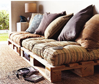
This great sofa is just two pallets on the floor 


This is my favorite pallet table with mosaic tile infill


Wall finish of pallet slats creates a rustic barn wood look

 
Super simple head board


Entertainment console and wine rack


Pallet pathway


Pallet planter

 
Pallet stair with storage underneath.

 
Pallet barn, the slats spacing allows light and air to infiltrate the space.

 
These photos are of a pallet partition in a warehouse space used for a pop-up performance art space in Los Angeles


Or go all the way and make the whole house out of them!


Space Concept for The Still Bar


  • Space Concept

    The Still Bar, Los Angeles
    The concept for the space was inspired by the history of liquor craft in America.  From early traditions through prohibition, the artifacts and processes provide a rich and eclectic palette to create a space for today’s liquor connoisseurs.
    The exterior is completely redesigned to provide maximum visual street impact.  Curved black gun metal riveted panels allude to stills made by bootleggers in the early 1900s.  Red warehouse font signage is illuminated by a custom side light washing over the matte black plaster facade.   Louis Poulsen vintage inspired warehouse lighting provides illumination for the exterior patio seating which is separated from the interior space by a fully retracting copper clad folding door system.
    The interior space features a full sized bar area with a custom industrial inspired iron beer tap, gun metal bar front, distressed metal wall finish, and a custom gear-works kinetic sculpture housed in the backlit translucent bar top. All delicately illuminated by a custom copper pipe work lighting sculpture inspired by the drip of liquor from a still pipe.  An illuminated liquor shelf wraps the bar back and washes the wall with light passing through the liquor stored on glass shelving held by the copper pipe sculpture, along with a collection of vintage stills that are designed into the aesthetic of the bar.   The lounge area is appointed with a custom distressed leather Chesterfield banquette and custom whiskey crate tables with color changing LED under lighting.   The vault is defined by floor to ceiling custom copper clad backlit liquor cabinets accessed by a rolling library ladder.  A sculptural motorized lift and conveyor system delivers bottles of liquor right to the bar, while an extruded circular gun metal ceiling feature creates a stunning anchor for a hanging Edison chandelier. A vintage iron spiral stair leads guest to an intimate still inspired riveted metal tasting room nestled in the newly created mezzanine.  Finishes throughout evoke the feeling of liquor craft from copper penny tile, running bond subway tile, riveted distressed ironwork, antique copper, and distressed metal.
  • Concept Boards

  • Final interior renderings from design model by Josef Giwargis

    • Design Model

    • Partial Floor Plan

    • Section


    • Interior Perspective

    • Interior Perspective